

A USER-CENTERED DIGITAL EXPERIENCE FOR PULMO
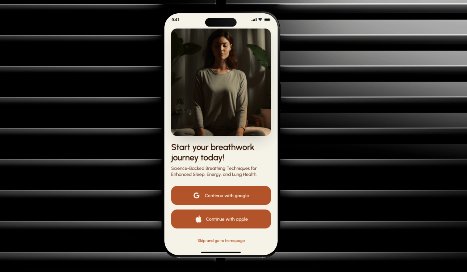
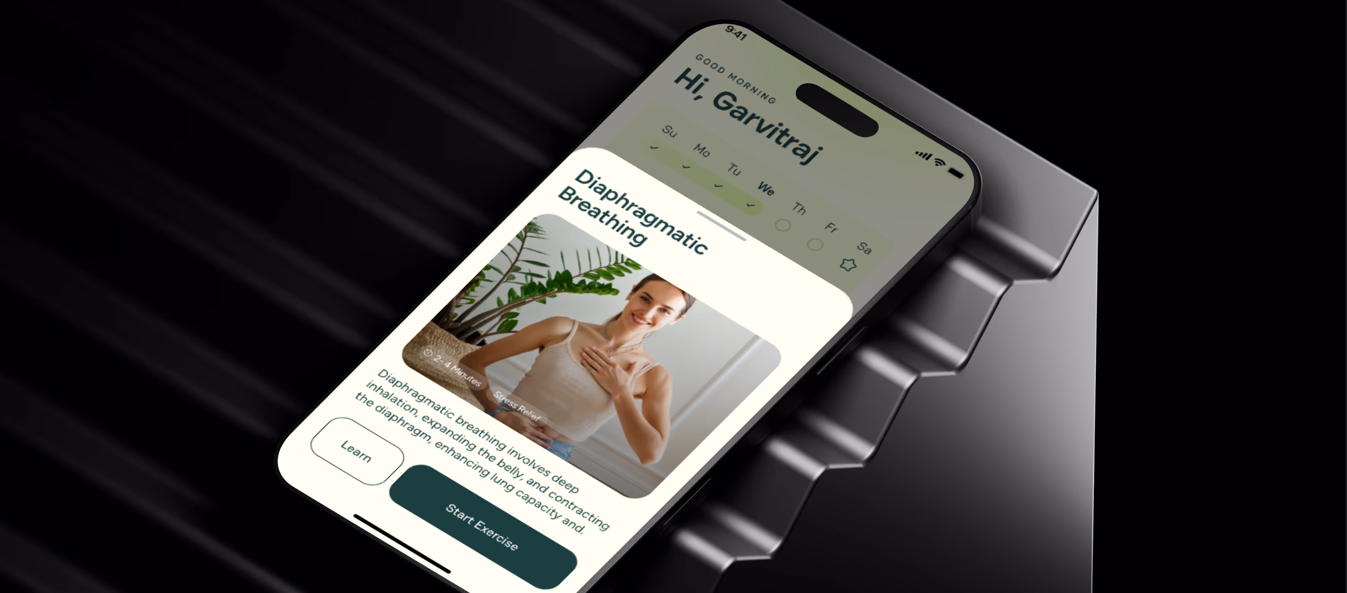
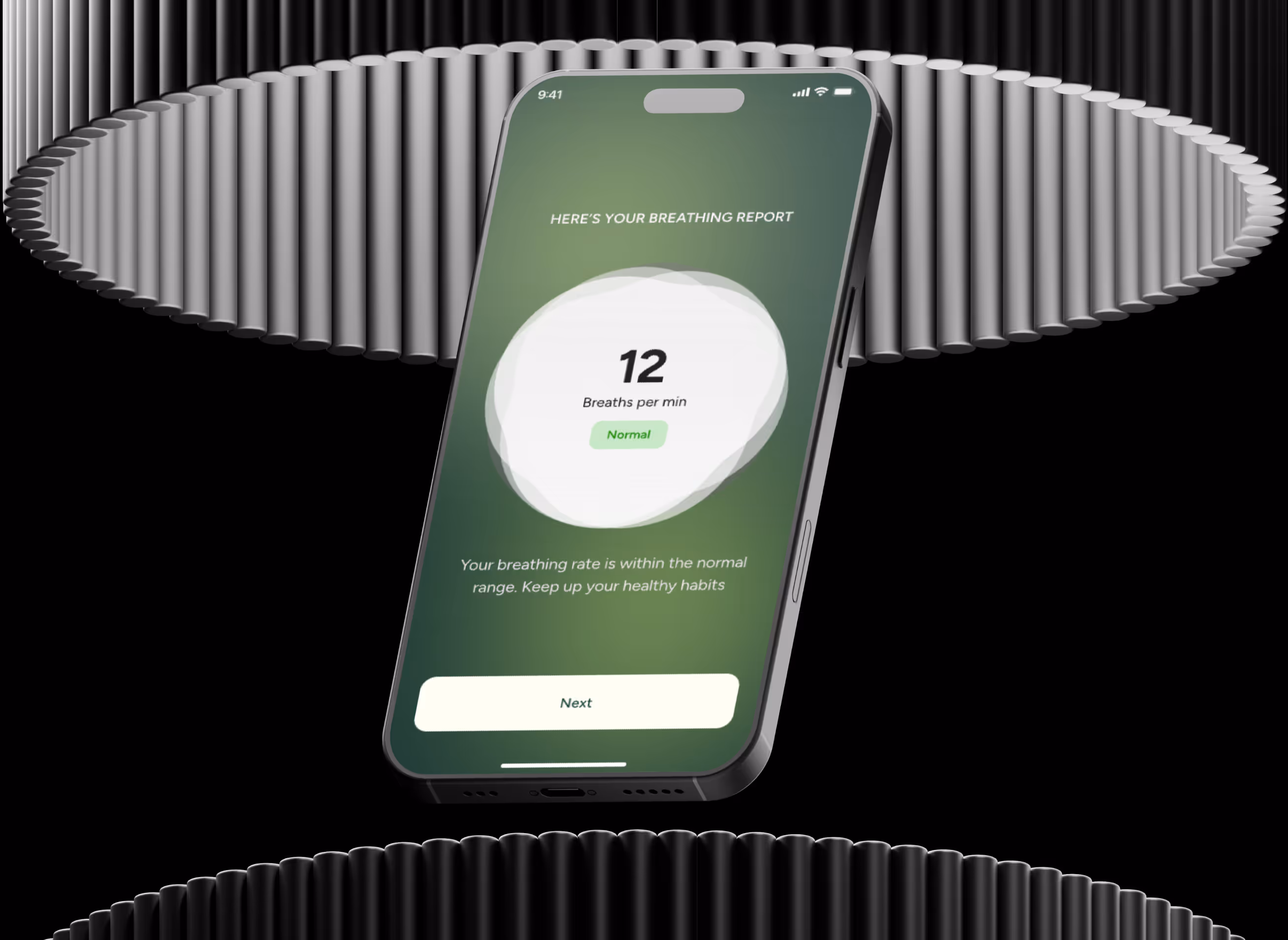
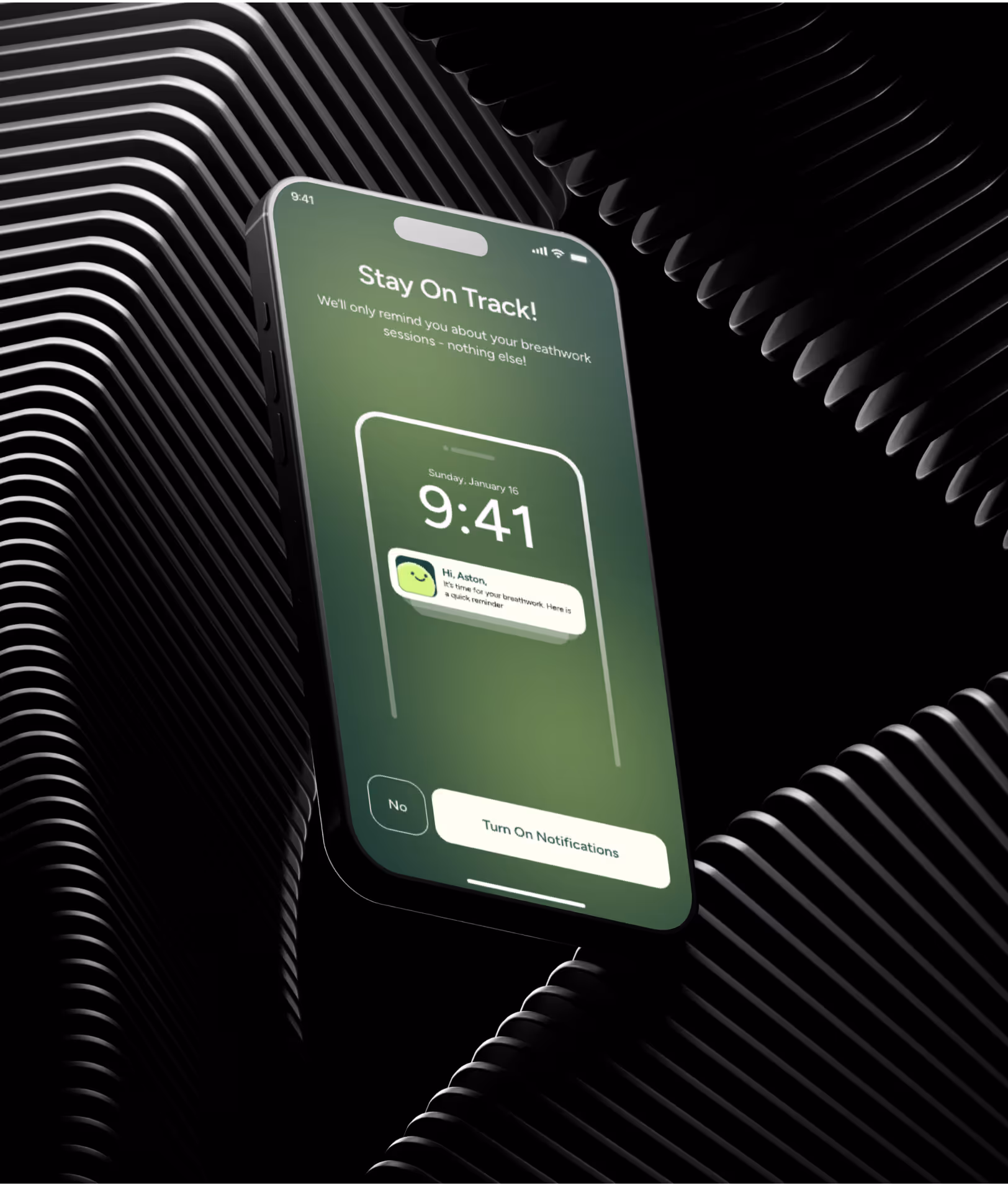
Pulmo is designed to help people track and improve their lung health. The website and app experience were created to make it easy for users to understand the value of the app, explore its features, and download it with confidence. The focus was on simplicity, clarity, and trust in every interaction.
Work overview
Pulmo provides a platform for users to monitor and better understand their respiratory health. The project included designing the app experience and building the website in Framer. The goal was to create a cohesive brand presence across both digital touchpoints.
Objective
Communicate the value of the Pulmo app clearly
Create a clean digital experience that feels trustworthy
Make it easy for users to download the app and explore its benefits
Ensure visual consistency between the website and app design
Process Involved
Discovery & Research
We started by understanding Pulmo’s mission and key features. This helped define what information needed to be prioritized on the website and how to communicate the app’s value.
Design
Phase
Using Figma, we designed layouts that are clear and approachable. The app screens and website elements were created to support ease of use and visual consistency.
Development Phase
The website was built in Framer to ensure fast performance and responsiveness across devices. Interactions were kept smooth and purposeful.
Review & Refinement
After initial builds, we reviewed and refined elements to ensure clarity, usability, and alignment with Pulmo’s brand values.
CHALLENGE
While ACME CORP delivers powerful drone solutions, the existing web platform faced key UX and UI challenges that affected usability, clarity, and overall user experience.
Complex Navigation
Users struggled to find essential features like flight data, analytics, and mission planning due to cluttered menus and inconsistent hierarchy.
Complex Navigation
Users struggled to find essential features like flight data, analytics, and mission planning due to cluttered menus and inconsistent hierarchy.
Complex Navigation
Users struggled to find essential features like flight data, analytics, and mission planning due to cluttered menus and inconsistent hierarchy.
Visual lang.


See how our happy client are raving about us
Consistency Across Product and Web
They helped us redesign both our website and app, and the experience was smooth throughout. Feedback was handled well, and the designs stayed consistent as things evolved. It felt like working with an internal team.


Trusted by 30+ teams across the globe
READ THE FAQs
Can't find your answer ?
Book a call with our team to get a prompt support.
Who do you usually work with?
We work with startups, growing product teams, and agencies that need reliable design and no-code execution. Most of our clients partner with us on an ongoing basis rather than one-off projects.
What services do you offer?
We focus on product and website design, along with no-code development using tools like Webflow and Framer. This includes websites, landing pages, MVPs, and ongoing product improvements.
We also support add-on work such as pitch deck design and other visual assets when it’s part of a broader engagement.
How is this different from hiring a freelancer or an in-house designer?
With us, you get a managed team that starts quickly and scales as needed, without the hiring, onboarding, or long-term overhead. Unlike freelancers, we handle delivery end-to-end. Unlike in-house hires, you stay flexible.
Do you work as a team extension or white-label?
Yes. We often work as an extension of internal teams and agencies. We adapt to your workflows and tools, and can stay client-facing or operate quietly in the background when needed.
What’s your starting budget or average project size?
Our engagements typically start at $2,000 USD. Most clients work with us on monthly retainers, depending on scope, pace, and level of involvement.